Presentation and Graphics
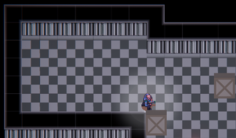
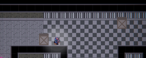
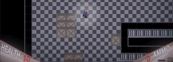
In this devlog I'll be going over the presentation and graphics that I've chosen to use in this project. The general style I wanted to go for was that of a 90s arcade game, with pixelated graphics, glowing colours and big solid particle effects.
To achieve this I created a global post processing profile that implemented a light vignette on the screen, to add a feeling of claustrophobia to the scene, some colour grading to decrease the temperature and modify the tint slightly, as well as to increase the output of the red channel to make brighter colours pop and add flare to the scene. Also included is a white bloom effect to get that glowing effect from old arcade cabinets, combined with a bit of chromatic aberration mostly applied to the UI so that the playable space remains easy to see, while the static UI elements are given the most vibrant effect.

The scenery is a mesh of a factory floor themed palette, and a sort of wood floor storage section themed palette, combined to give a feeling of transition between the end of level 1, which blends the wooden floor into tiles, into level 2, then at the beginning of level 3 (seen in the attached image) with a transition back to the tiled floor as the levels become more sprawling.
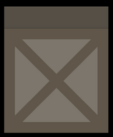
Found around each level are the boxes which players can hide behind for cover. These were the first original asset that I made in photoshop for this project, based on what I thought would most fit the theme of a military factory & storage depot.
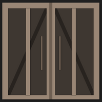
Another important asset I created was the end-of-level door, which transitions the player to the next level. I tried to make this match the box's color scheme, as in my head they were both made of wood and should therefore appear as if they were made of the same materials.
The colour is slightly different, mostly just to make it more visible to the player, so they don't accidentally run right past it if they're trying to escape some enemies in pursuit as they reach the end of the level.
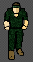
The last asset I have being worked on is the enemy sprite. These guys have been mostly just coloured circles, as a placeholder for when the enemy sprites are finished and animated. Some images of what these look like are attached in the image section above.
There are a few things to get finished for this part of the game, mostly the enemy sprites and some more movement effects for the player.
As for the feedback this week, most of them were bugs that were spotted or small tweaks to player/enemy movement & behaviour. One notable suggestion I got was to add a collider just outside of the player's FOV, that triggers enemies to be allowed to fire at the player, which will stop them from being able to snipe players from across the map, while maintaining that feeling of surprise when an enemy has spotted you off screen, ran towards you and has started shooting.
Files
Espionager (KIT109 Assignment Game)
A 2D top-down stealth action game inspired by the Metal Gear series of games.
| Status | In development |
| Author | Sevensz |
| Genre | Action |
| Tags | 2D, Pixel Art, Singleplayer, Stealth, Top-Down |
More posts
- Game GuideOct 14, 2023
- Implementation & DocumentationOct 14, 2023
- TestingOct 12, 2023
- UI & PolishOct 10, 2023
- Enemies and InteractionSep 22, 2023
- Level BlockingSep 11, 2023
- Player MovementSep 07, 2023
- ConceptAug 11, 2023
Leave a comment
Log in with itch.io to leave a comment.